Branding • Design • Web
ENERGYNE - Organic Superfoods
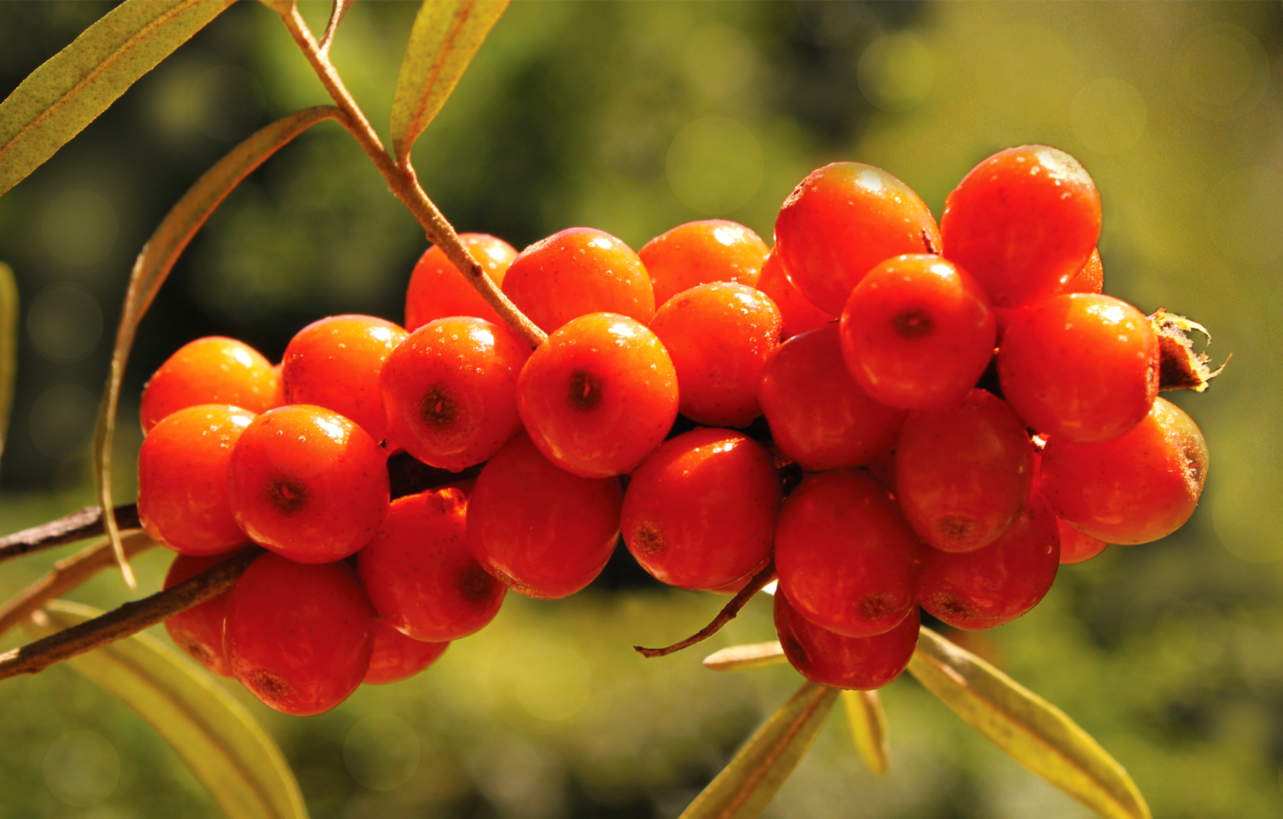
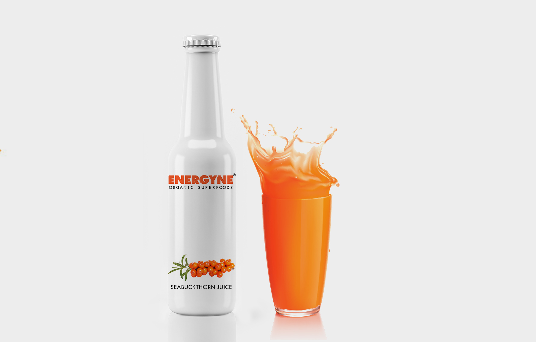
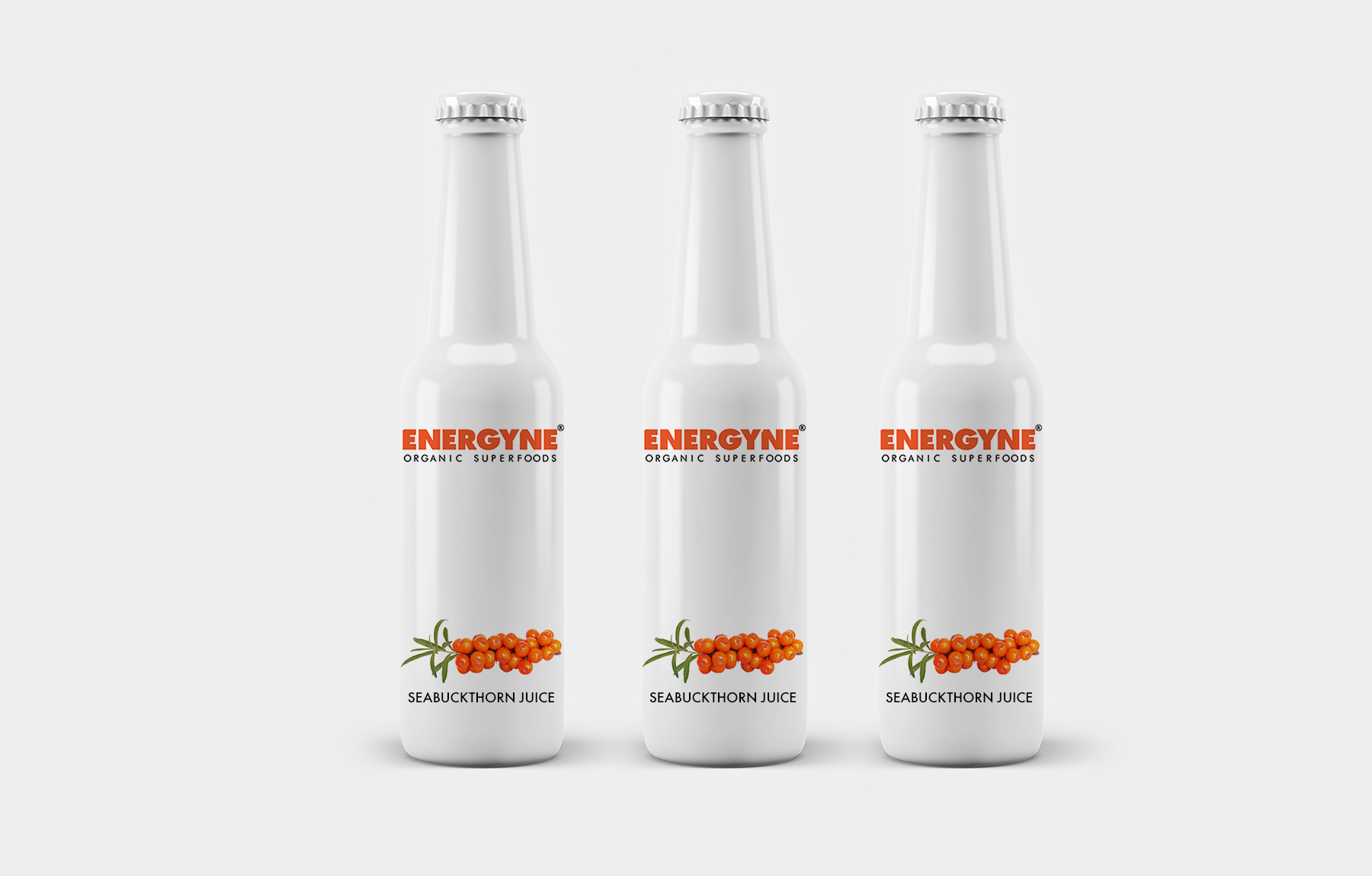
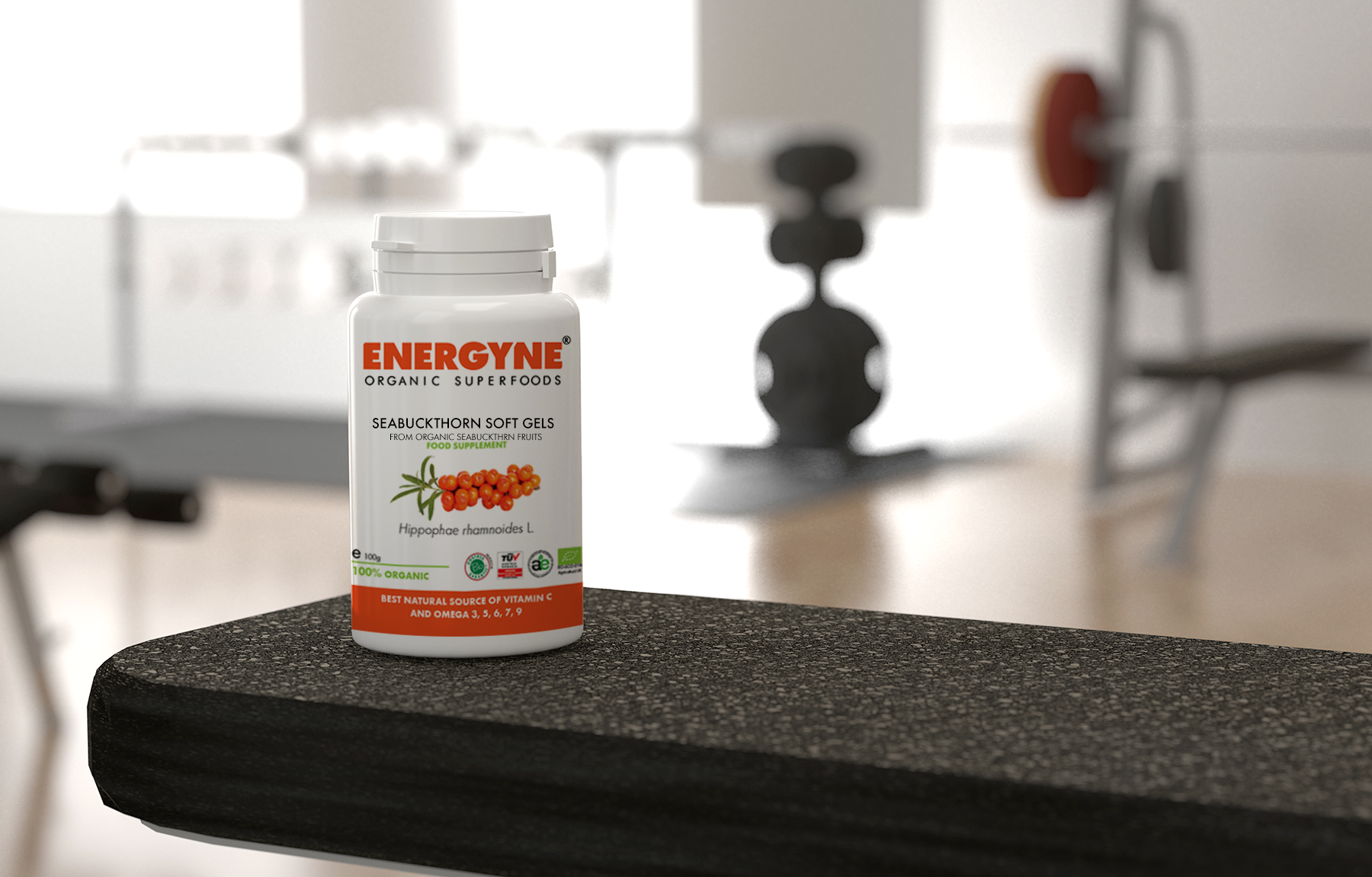
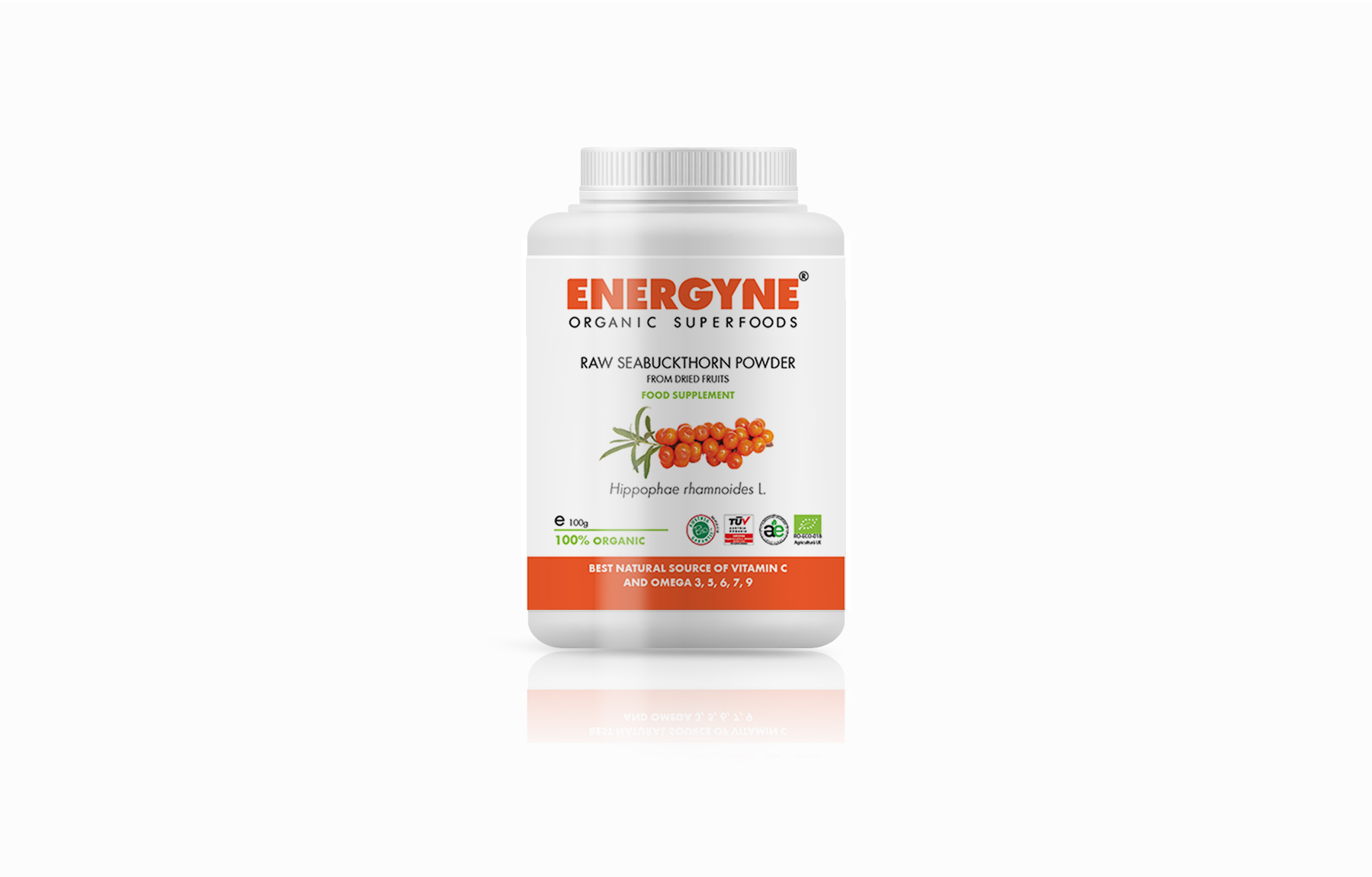
Naming, logo and package design. Energyne is a range of premium products made from organic seabuckthorn fruits, the main target market being young, energetic adults with above average income and a continuous wish for a healthy living. As the main color of the energy supplements on the dedicated shelves is black, I proposed the opposite, minimal design and high contrast orange / white. The collaboration was challenging in a way that was not a fit for either of us and I finally decided to step away. The client only kept the name I proposed - ENERGYNE - and continued develop the brand with a different approach which I think is very stylish.
- ENERGYNE - Organic Superfoods
- Organic Superfoods
- Naming, Logo, Packaging
- 2018
- www.biocatina.com/products/
Name & Logo
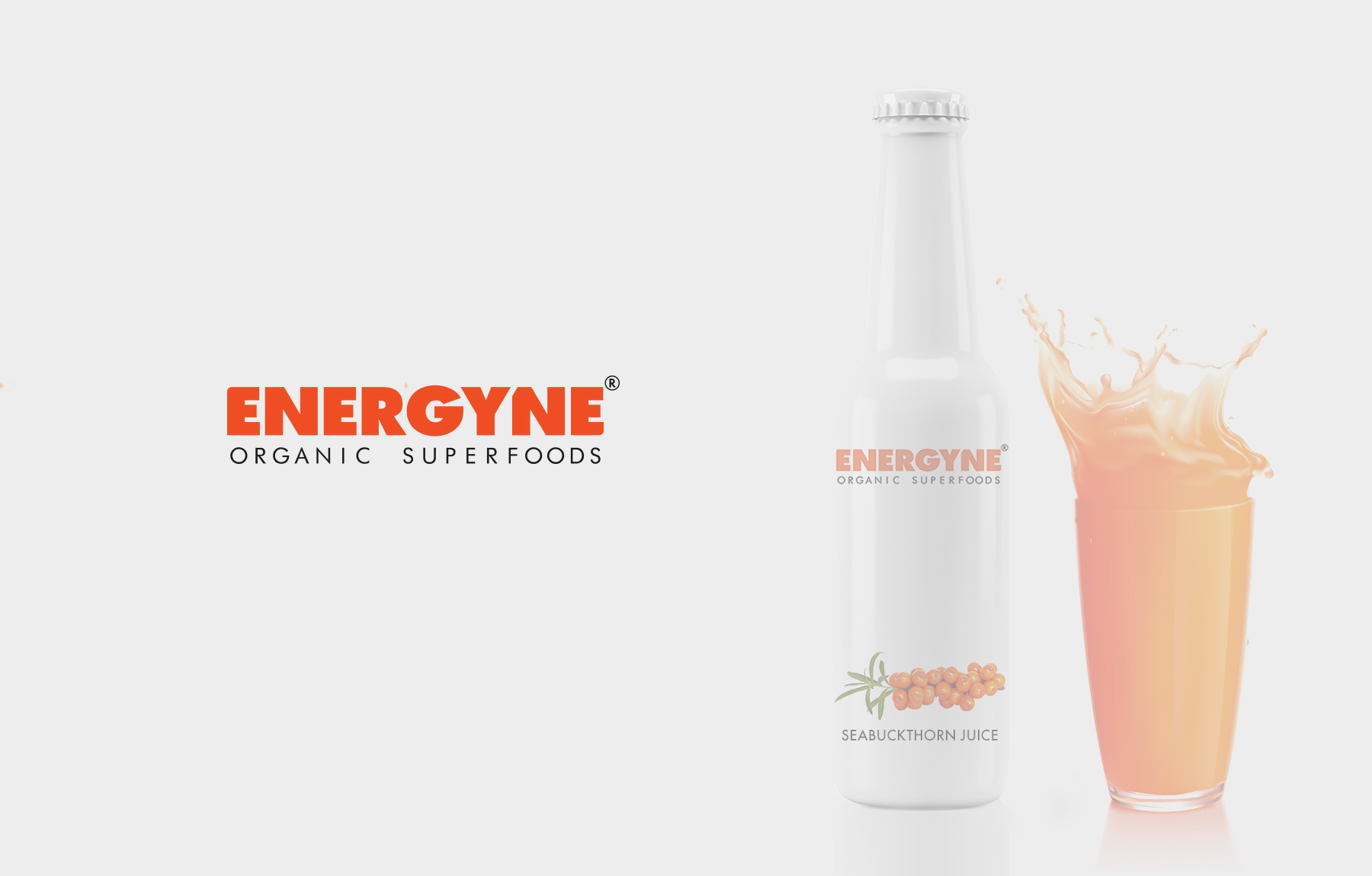
Product photo
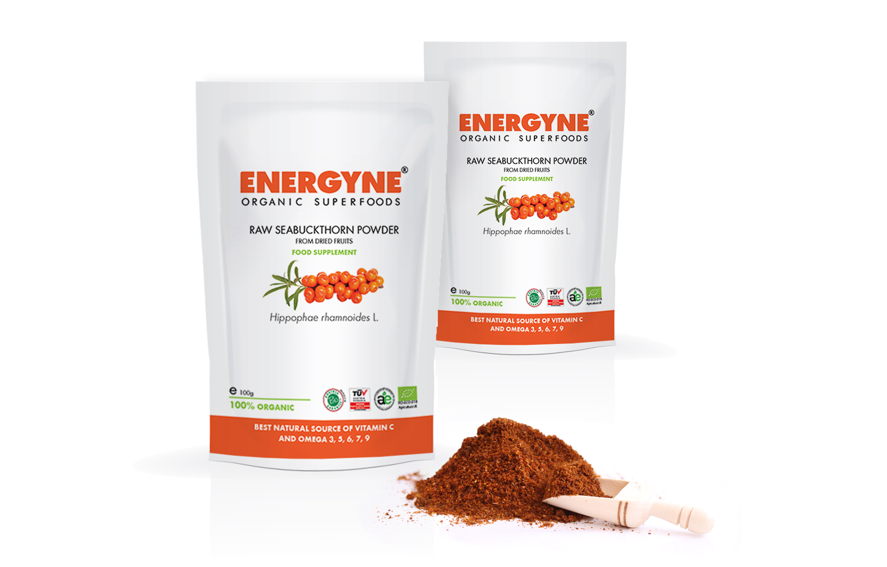
Packaging
Packaging
Packaging
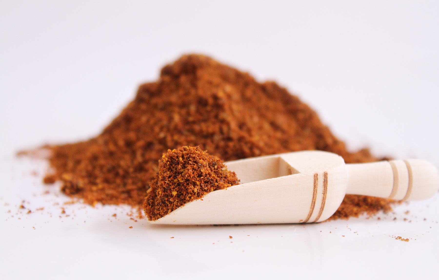
Product photo
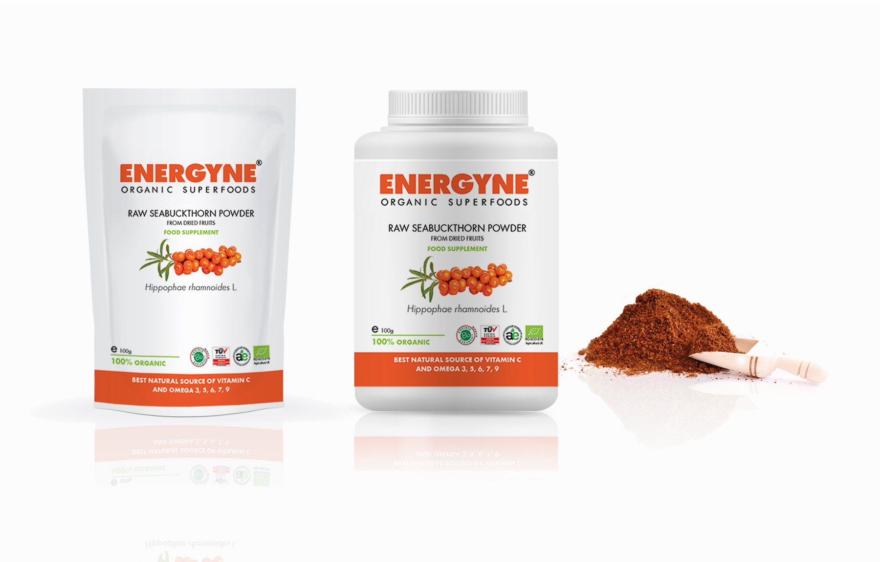
Packaging
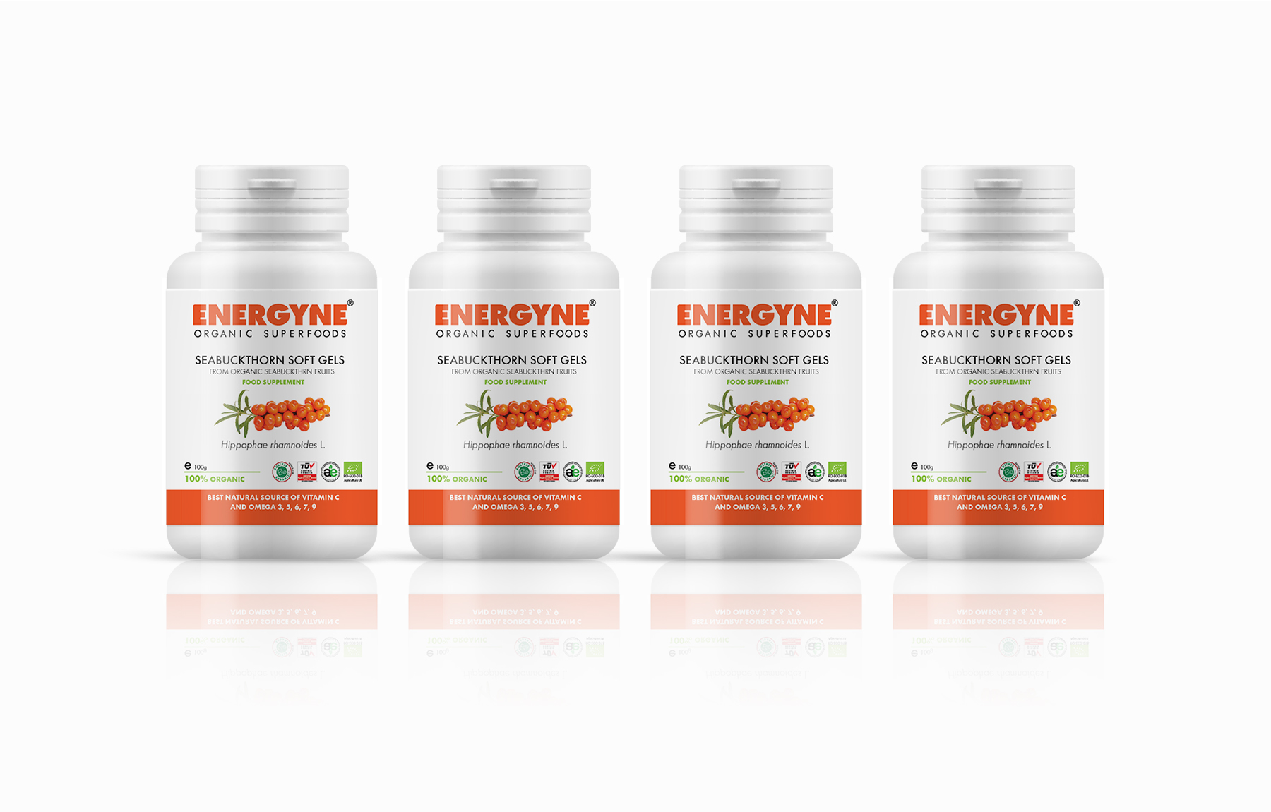
Packaging
Packaging
Packaging